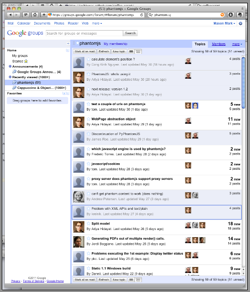
I visited Google Groups today, to read some archives and think about posting a question to the PhantomJS (awesome, btw) group. I was startled to find that the UI was not the deplorable piece of shit that I was used to, nor was it the completely dysfunctional 'new' version that didn't work at all and yet was foisted upon me automatically from time to time and had to be manually disabled repeatedly.
Instead, it was something totally new (to me), and actually quite good, as far as web-based email list interfaces go:

Any decent email client is still better for a list you read a lot, but at least this thing isn't inferior in every single conceivable way anymore. Good use of avatar pictures (albeit without Gravatar support, which is retarded), attractive and responsive layout, and a good-looking and functional threaded discussion view when you click on a thread topic.
good job goog, now try a little harder on your phone OS pls